/TUTORIAL · ASCII DOTS
How to Convert an Image to ASCII Dots
By Kailash · Updated June 9, 2026 · 3 min read
The short answer
Open a free browser-based ASCII generator, drop in your image, and switch the render mode to Dots. Instead of letters, the tool draws a filled circle in each cell and scales it by brightness — a halftone, dot-matrix look. Tune the dot size and contrast, then export as PNG or GIF. It takes under a minute, costs nothing, and your image never leaves your device.
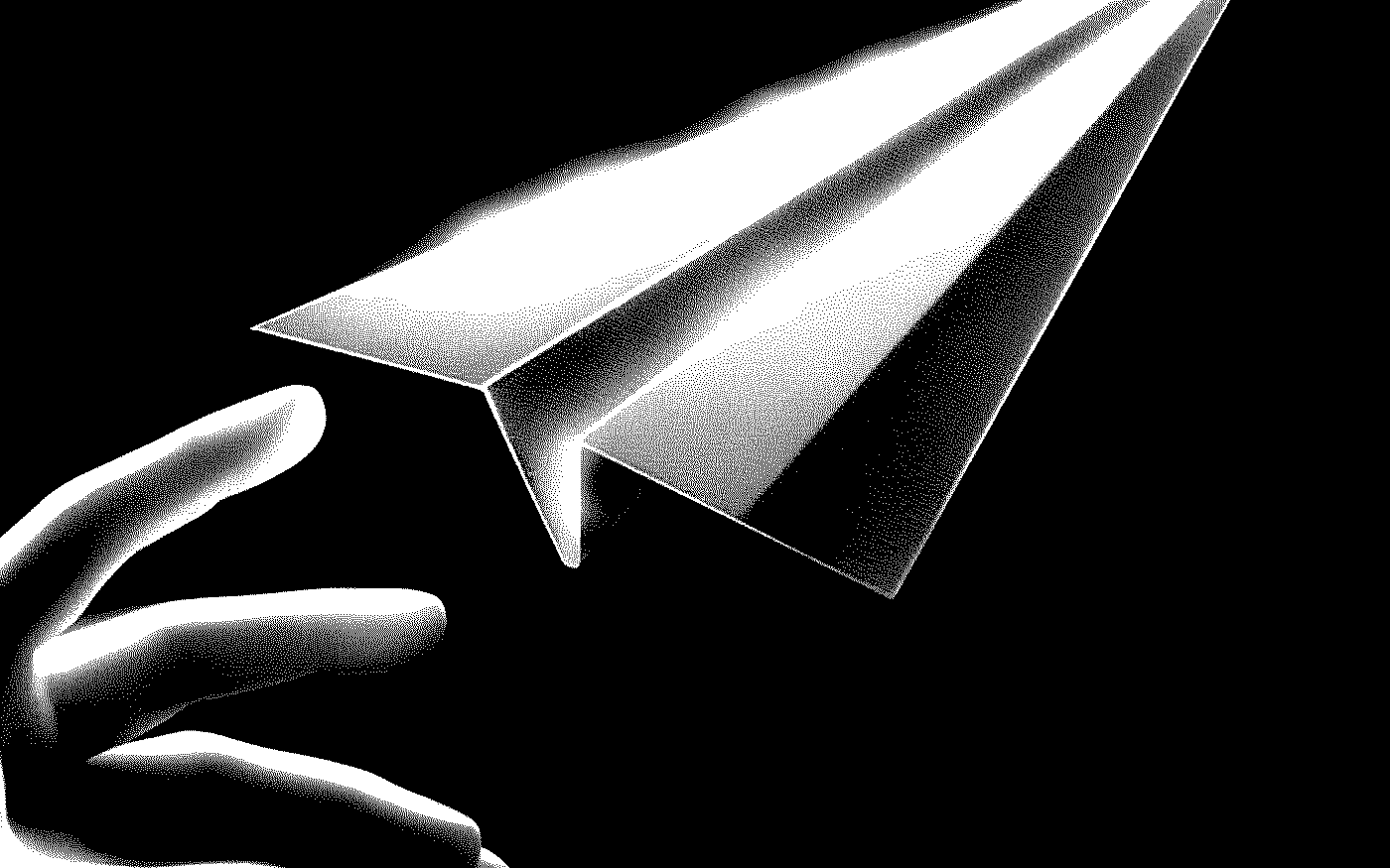
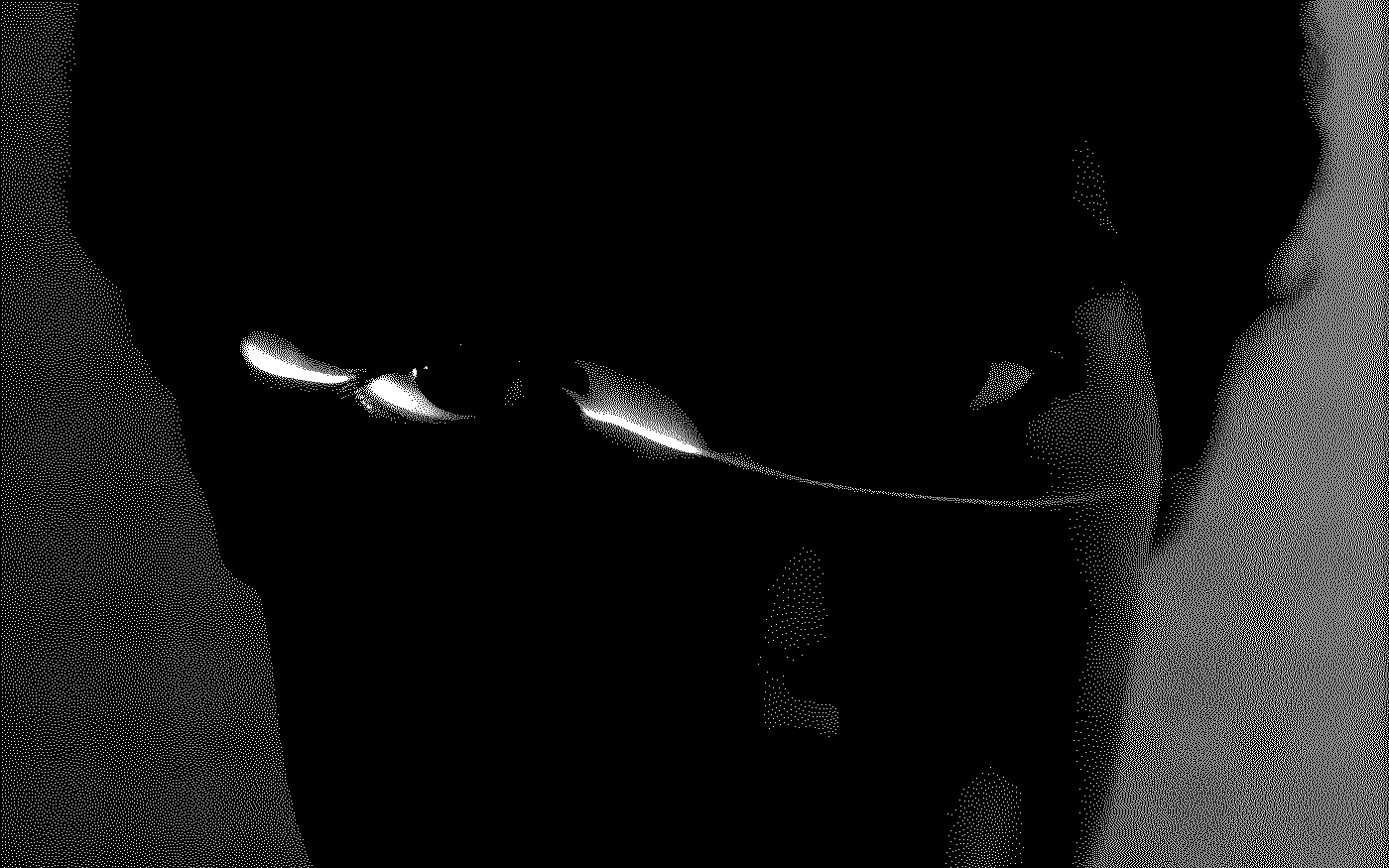
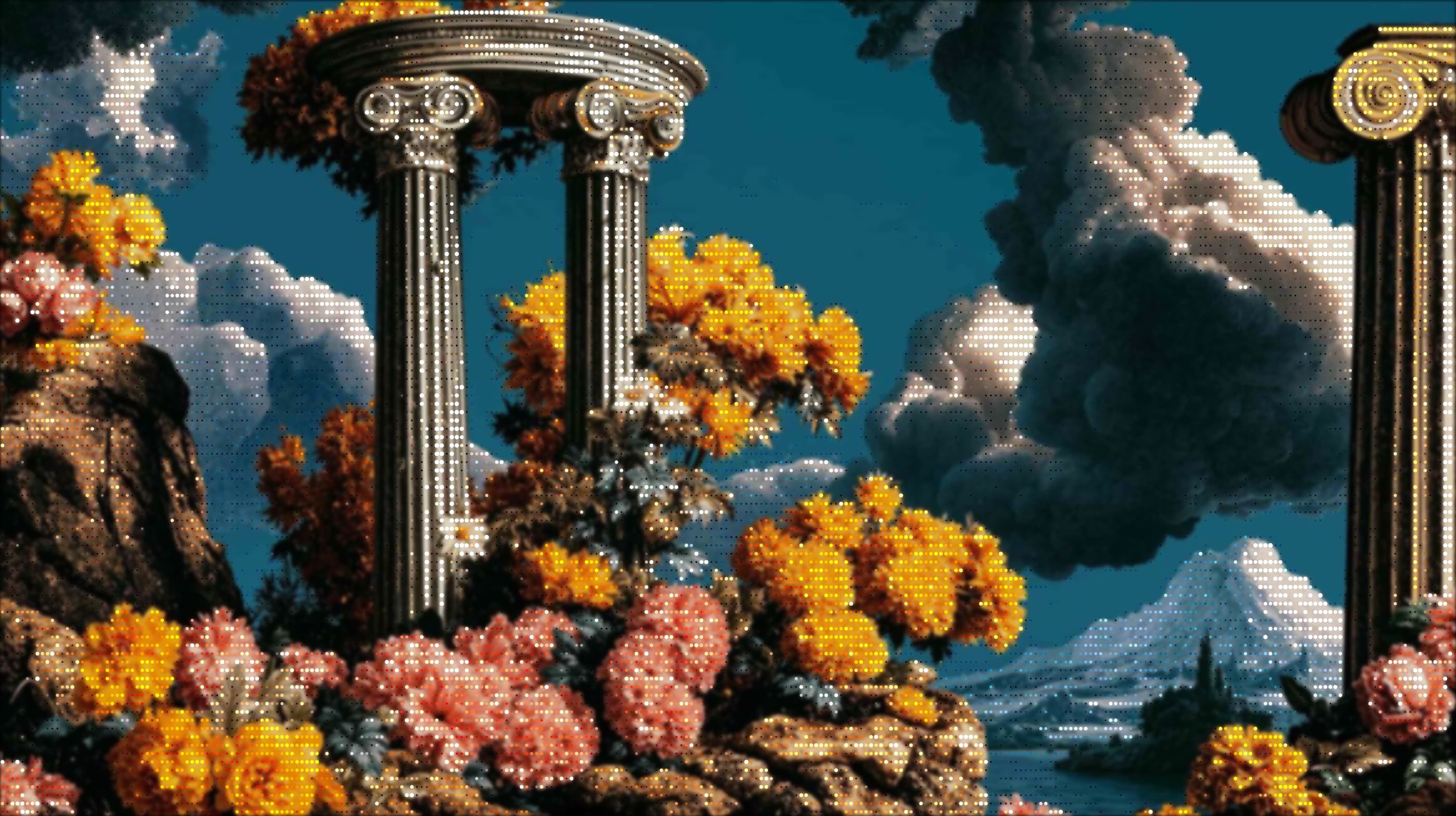
ASCII "dots" swap the usual text characters for a grid of dots mapped to the image's brightness — so the picture reads like a newspaper halftone or a screen print made of dots rather than glyphs. It's one of the cleanest, most graphic looks you can pull from a photo, and you don't need Photoshop or any plugins to do it. This guide shows exactly how, using the real controls in the editor, and how to keep it crisp rather than muddy.
What you'll need
Just a browser and an image. We'll use ASCII Magic — it's free, needs no signup, and runs entirely on your device (nothing is uploaded). Images with clear contrast and a recognisable subject convert best; flat, low-contrast pictures give a more even, texture-like field of dots.
Convert an image to ASCII dots in 5 steps
Open the editor and add your image
Open the ASCII Magic editor and drop your image onto the canvas — or click to browse, paste from the clipboard, or hit Inspire Me for a sample. It takes video too. Everything is processed locally in the browser, so your file never leaves your device.
Set the Style to Dots
In the Characters panel on the right, open the Style dropdown and choose Dots. The image instantly re-renders as a grid of dots mapped to brightness — a live halftone, dot-matrix look that updates as you tweak everything below.
Set the dot scale with Font Size
Font Size is what controls how big the dots are. A smaller Font Size packs in more, finer dots for a delicate, newspaper-style halftone; a larger one gives bigger, bolder dots for a graphic poster look. Two toggles fine-tune it:
- Invert Mapping — flips which tones get the heavier dots (great for dark-on-light vs light-on-dark).
- Dot Grid Overlay — adds a subtle printed-grid feel on top of the dots.
Shape the tone with the Intensity sliders
The Intensity section is where the halftone snaps into focus:
- Contrast and Brightness — set the tonal range so dots run cleanly from full to nearly empty.
- Coverage — how much of the image fills with dots versus stays open.
- Density and Edge Emphasis — how tightly the dots cluster and how crisp the outlines stay.
Pick a background and export
In Background, choose None (Transparent) for a clean PNG you can drop anywhere — or Solid Black, Blurred Image or Original Image. Set Resolution from 1× to 4×, then hit Export as PNG or JPG (or GIF / MP4 if you've turned on animation or loaded a video). No watermark, ever. Big enough for a poster or print.
Tips for dot art that actually looks good
- Start high-contrast. A bright subject on a dark background (or vice versa) gives the dots a clear range to work with — flat lighting flattens the effect.
- Crop tight. Dots have limited resolution, so fill the frame with your subject rather than spending dots on empty background.
- Pick Font Size for the medium. Fine dots for screen and web; bigger, bolder dots if it's going to print or onto a shirt.
- Add a retro screen look. The Post-Processing section has Scan Lines, Bloom, CRT Curvature and Glitch — a touch of each turns flat dots into a convincing old-monitor or risograph print.
Is ASCII dots the same as a halftone effect?
Closely related. A traditional halftone simulates continuous tone with a grid of printer dots; Dots mode does the same thing live in your browser, with the Font Size, Coverage, Density and Contrast controls standing in for the press. If you've ever wanted the comic-book / newsprint / risograph look without a design app, this is the fastest route to it.
Dots is one of 14 styles
Dots is the halftone look, but the same editor turns your image into classic ASCII characters, pixel art, voxel cubes, a photo mosaic, glitch art and more — browse all 14 styles here. They share the same controls, so the contrast and sizing you learned here carry straight over. Want motion? You can even turn a video into dots, frame by frame.