/GUIDE · DITHERING
The Complete Guide to Dithering
By Kailash · Updated October 9, 2026 · 10 min read
The short answer
Dithering uses a pattern of dots or pixels to simulate intermediate colours when you only have a few to work with. Floyd-Steinberg is the default for photos. Atkinson is the classic Mac look. Bayer (ordered) dither tiles cleanly and is stable in animation. Blue noise is the most natural. Halftone is the print / comic look. Below: when to pick which, what each one actually does, and a free browser-based dither generator that supports them all.
Dithering is having a moment. Searches for "dither effect" and "dithering image" are up roughly 900% year-on-year, driven by designers using the look to add retro texture to modern visuals: album covers, indie game art, riso-print mock-ups, Game Boy filters, 1-bit aesthetics in branding. Understanding which algorithm gives which look is the difference between "interesting texture" and "muddy noise." This is the complete guide.
What is dithering?
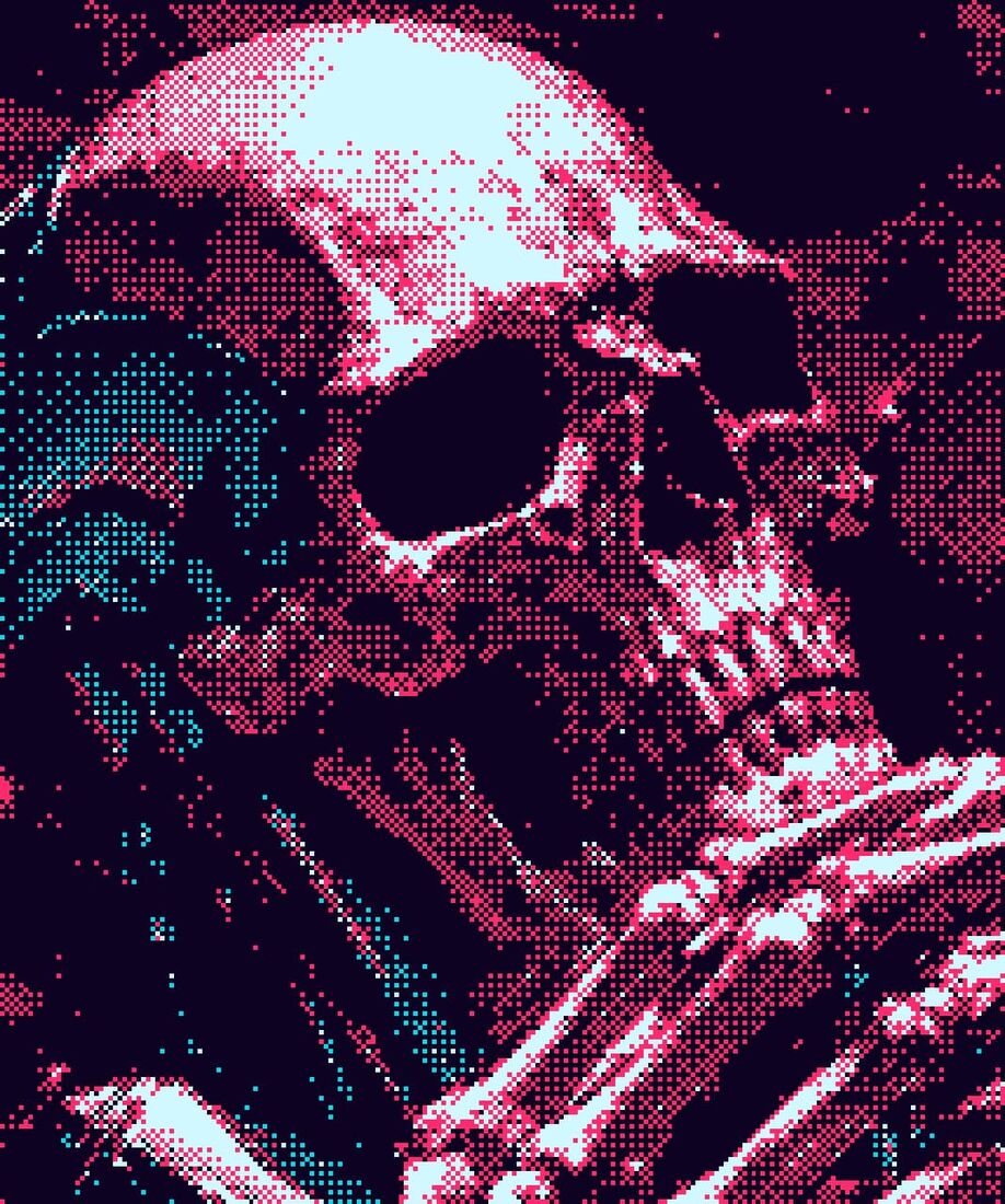
Dithering is the technique of using a pattern of two (or a few) colours to simulate intermediate colours your output cannot show directly. A black-and-white printer can only put down "ink" or "no ink" per pixel, but by clustering and scattering those marks, it can make your eye perceive grey. A 4-colour Game Boy palette can produce thousands of perceived tones once you dither between its four greens. Mathematically: dithering trades spatial resolution for colour depth.
Every dithering algorithm answers the same question, "given that I can only output a limited palette, which pixel should be which colour to best approximate the source image?" The differences between algorithms are how they decide.
Error-diffusion vs. ordered dithering
Two main families. Knowing which family you want is more useful than knowing the names.
Error-diffusion dithers (Floyd-Steinberg, Atkinson, Stucki, Burkes, Sierra) quantize each pixel to the nearest palette colour, calculate the leftover error, and spread that error to neighbouring pixels. The result is organic, with noisy-looking but very faithful tonal reproduction. Best for stills and photos.
Ordered dithers (Bayer 2×2, 4×4, 8×8, 16×16) compare each pixel against a fixed threshold matrix. The result is regular, a repeating pattern that tiles cleanly and looks rock-solid in animation. Best for tileable textures, animations, and when you want the dither itself to be a visible feature.
The algorithms, what they do, when to use them
Quick comparison first, prose deep-dive below. All fifteen ship in the ASCII Magic dither generator.
| Algorithm | Year | Type | Neighbours / matrix | Best for |
|---|---|---|---|---|
| Floyd-Steinberg | 1976 | Error diffusion | 4 neighbours (7/16, 3/16, 5/16, 1/16) | Default photo dither, faithful tones |
| Atkinson | 1980s | Error diffusion | 6 neighbours, only 6/8 of error diffused | Cleaner, contrasty, classic Mac look |
| Stucki | 1981 | Error diffusion | 12 neighbours, wider kernel | Fine-detail photos, smoothest look |
| Sierra Lite | 1989 | Error diffusion | 3 neighbours, smaller kernel | Fast Floyd-Steinberg alternative |
| Bayer (2x2, 4x4, 8x8, 16x16) | 1973 | Ordered | Fixed threshold matrix, tiles cleanly | Animation, tileable backgrounds, retro pattern |
| Blue noise | 1993 (Ulichney) | Ordered (precomputed mask) | Blue-noise mask (no clumping, no pattern) | Modern, natural, hi-fi photos |
| Halftone | 1880s (print origin) | Dot-size grid | Dots whose size scales with brightness | Newsprint, comic, riso print look |
Floyd-Steinberg (1976)
Full guide to Floyd-Steinberg dithering, with a live tool →
The classic. Error diffuses to 4 neighbours (right, below-left, below, below-right) with weights 7/16, 3/16, 5/16, 1/16. Produces faithful, organic dithering with a bit of structured noise. Use it as your default for photos. If you only learn one dither algorithm, this is the one.
Atkinson (1980s, Apple)
Full guide to Atkinson dithering, with a live tool →
Bill Atkinson's algorithm from the classic Mac. Only diffuses 6/8 of the error (loses some, hence the cleaner look) to 6 neighbours. Produces a cleaner, more contrasty dither with brighter highlights and deeper shadows. Use it for the classic Mac / HyperCard aesthetic, or when you want dither without the noisy feel.
Stucki (1981)
Wider error distribution (12 neighbours, larger weights). Produces fine, smooth dithering with less structured noise than Floyd-Steinberg. Use it for fine-detail photos where you want maximum smoothness.
Bayer 2×2, 4×4, 8×8, 16×16 (ordered dithering)
Full guide to Bayer and ordered dithering, with a live tool →
The original ordered dither (1973). Each pixel is compared against a fixed matrix; brighter pixels turn white, darker stay black. Larger matrices give finer tonal resolution but more visible pattern. Bayer 4×4 is the iconic ordered dither look, the visible "screened" pattern you see on Game Boy or early Macintosh games. Use it for animations (rock-solid no jitter), tileable backgrounds, and when you want the dither pattern to be a visible feature.
Blue noise
A modern technique using a pre-computed blue-noise threshold mask. Produces dither that looks random but is evenly distributed, avoiding the structured patterns of Bayer and the noise of error-diffusion. Use it for the most natural-looking dither without visible patterns. Great for hi-fi photos and modern indie game art.
Halftone
Strictly speaking, halftone is a separate technique (a grid of dots whose size scales with brightness) but it is in the same family. Produces the classic comic-book / newsprint look. Use it when you want the print aesthetic, not the digital one.
Line dither
Lines instead of dots, the line frequency varies with brightness. Produces a hatched, etched look, like an engraving. Niche but striking.
Which algorithm should you pick?
- Default photo: Floyd-Steinberg with a Game Boy or 1-bit palette.
- Cleaner, more contrasty: Atkinson.
- Animated / tileable / video: Bayer 4×4 (it does not jitter frame to frame).
- Most natural, no visible pattern: Blue noise.
- Comic / print aesthetic: Halftone (see /styles/dots).
- Etched / engraved look: Line dither.
- Fine detail photos: Stucki.
Palettes that pair well with dithering
- 1-bit (pure black-and-white), the most iconic dither look. Riso prints, Macintosh, retro zines.
- Game Boy (4 greens), the unmistakable handheld feel. Pair with Bayer 4×4 for the most authentic.
- C64 (16 retro colours), 8-bit feel with more flexibility than Game Boy.
- NES (54 colours), classic console aesthetic.
- Pico-8 (16 modern indie-game colours), saturated and contemporary.
- CGA (4 colours, magenta/cyan/white/black), the classic DOS-game aesthetic.
- Custom, pick your own 2-16 colours for brand-aligned dithering.
How to dither an image for free
Open ASCII Magic's free dither generator, drop in a photo, switch the render mode to Dither, pick an algorithm and a palette, then export PNG (up to 4×), GIF (for an animated dither), or MP4 (if the input was a video). It runs in your browser, no upload, no signup, no Photoshop required.
Open the dither generator →Dithering in Photoshop vs. browser
Photoshop has a dither option in Image → Mode → Indexed Color → Forced Pattern / Diffusion / Noise. It is functional but limited to one or two algorithms, no Bayer matrix choice, no built-in retro palettes, and you pay for Photoshop. A browser-based dither generator gives you every algorithm, every retro palette, and live preview, free.
Why dithering is trending in 2026
A few converging reasons: 1-bit aesthetics are back as a deliberate counter-move to perfect-resolution AI imagery; riso printing is in vogue for indie publishing; Game Boy and 8-bit nostalgia keep appearing in album art, indie games, and brand identity; and designers are using dither to add texture to flat digital work. "Dither effect" and "dithering image" search volume is up roughly 900% year-on-year. If you make visual content, this is a useful tool to have in 2026.
A quick history of dithering, Ulichney to Obra Dinn
Dithering is older than digital. Newspapers were reproducing photographs with black ink and paper in the 1880s using halftone dots, the same idea (fake grey with a spatial pattern of black), just with mechanical screens instead of algorithms. The digital version arrives in 1973 when Bryce Bayer, working at Kodak, publishes the ordered-dither matrix that still carries his name. 1976, Robert Floyd and Louis Steinberg publish the error-diffusion algorithm that becomes the industry default for the next fifty years. 1981, Peter Stucki publishes a wider-kernel variant. 1987, Robert Ulichney publishes Digital Halftoning, the book that formalises the whole field and introduces blue-noise dither as the mathematically ideal ordered technique. Also 1980s, Bill Atkinson at Apple ships his cleaner variant in HyperCard, MacPaint and the Apple LaserWriter.
Then hardware makes it a look people love. The Game Boy Camera (1998) turns real-life snapshots into 4-shade dithered portraits so cleanly that a whole generation associates dithering with the handheld's green screen. In 2018, indie developer Lucas Pope releases Return of the Obra Dinn and its 1-bit-with-3D-shading dither becomes the most-copied art direction of the decade, kicking off the current 2020s revival that put dither back on album covers, indie games (Umurangi Generation, Signalis, Iron Lung) and brand identities. That is the arc: 1880s newsprint → 1976 Floyd-Steinberg → 1987 Ulichney → 1998 Game Boy Camera → 2018 Obra Dinn → today.
Same editor for 100+ styles
Dither is one of 100+ styles in the same browser editor. The same workflow turns a photo into pixel art, mosaic, voxel cubes, halftone dots, ASCII characters or LEGO mosaics. Browse all 100+ styles here.