
/ALGORITHM · ATKINSON
Atkinson Dithering
By Kailash · Updated October 9, 2026 · 6 min read
The short answer
Atkinson dithering is an error-diffusion algorithm written by Bill Atkinson at Apple in the mid-1980s for the original Macintosh. It differs from Floyd-Steinberg in one specific way: it passes on only six eighths of each pixel's error instead of all of it, spread over six neighbours rather than four. Throwing away a quarter of the error is what gives it the look people recognise from MacPaint: crisp midtones, and highlights and shadows that blow out to clean white and solid black instead of holding detail.
The kernel
Every error-diffusion algorithm is really just a small table saying where the rounding error goes. Atkinson's is six neighbours, each taking one eighth:
        X   1/8  1/8
  1/8  1/8  1/8
       1/8
Compare that with Floyd-Steinberg, where the four weights are 7/16, 3/16, 5/16 and 1/16 and add up to exactly 1. Atkinson's six eighths add up to 0.75. That missing quarter is not a bug or an approximation of the hardware it was written for, it is the entire character of the algorithm. Error that never gets passed on is error that never pulls a neighbouring pixel across the threshold, so bright regions stay bright and dark regions stay dark.
What it actually looks like
Three things give an Atkinson render away:
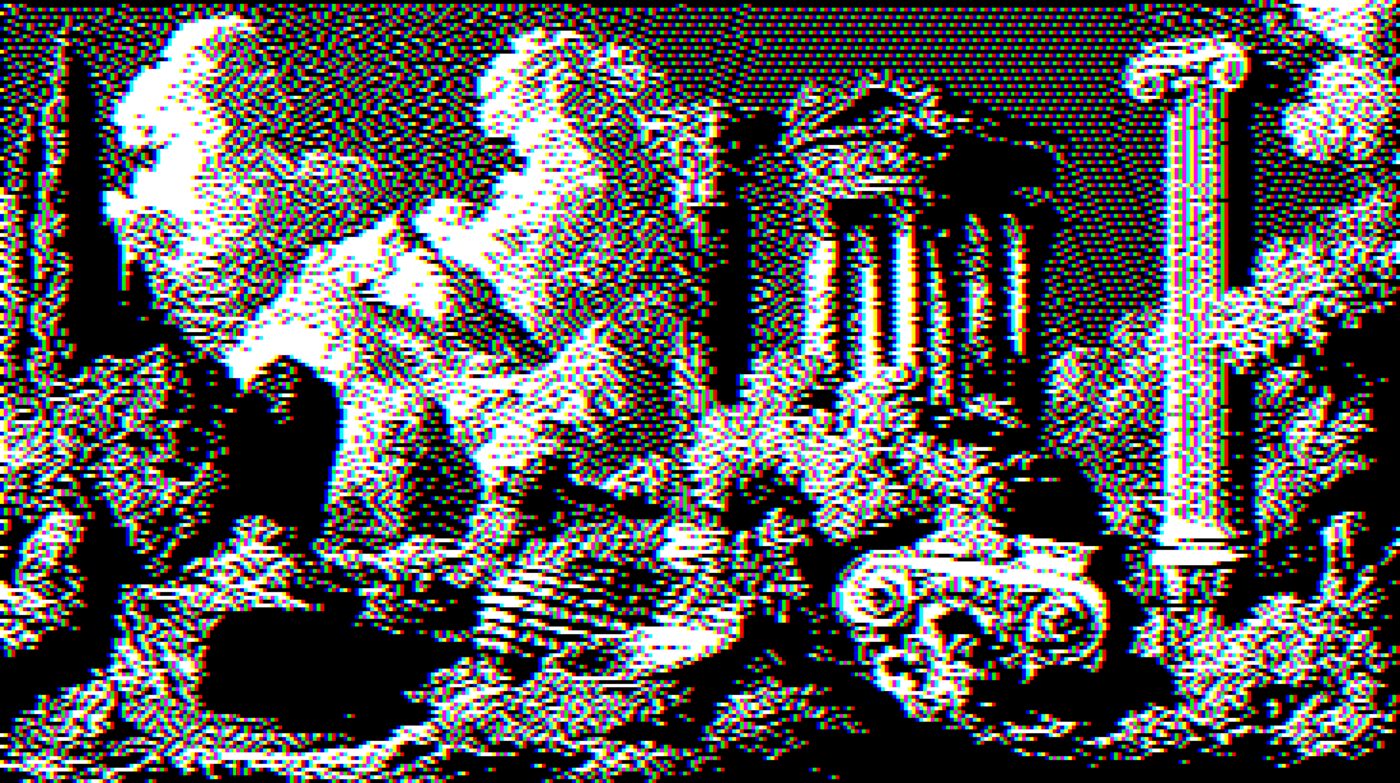
- Blown highlights. A bright sky goes to flat paper white rather than a fine speckle. Floyd-Steinberg would keep dithering there.
- Crushed shadows. The same thing at the other end, solid black where a full-error algorithm keeps texture.
- Clean midtones. This is where the quarter you threw away buys you something. The speckle is tighter and less wormy than Floyd-Steinberg, which is why faces and skin tones tend to read better.
That combination is why it suits high-contrast source material and struggles with flat, low-contrast photographs, where it will happily eat both ends of the range and leave you a mid-grey mush. If that happens, raise contrast before you dither rather than after.
Where you have seen it
MacPaint and the 1-bit screen of the original 128K Macintosh are the obvious ones. Apple's HyperScan scanning software used it. The Game Boy Camera is often lumped in with it, but that is a different technique: it dithers in hardware against a fixed 4×4 threshold matrix held in the cartridge, which is ordered dithering rather than error diffusion. More recently it has become the default 1-bit aesthetic for album art, zines, poster design and Playdate games, largely because it is the error-diffusion algorithm that most clearly reads as a deliberate style rather than a compression artefact.
Why a quarter, and why eighths
The shape of this kernel is a 1984 engineering decision, not an aesthetic one. Dividing by eight is a three-place right shift, which the 68000 in the original Macintosh did in a single cheap instruction. Dividing by sixteen the way Floyd-Steinberg does is also a shift, but Floyd-Steinberg needs four different multipliers (7, 3, 5, 1) before those shifts; Atkinson needs none, because every neighbour takes exactly the same amount. The whole kernel is "shift right three, add to six places".
So the missing quarter is not a deliberate artistic choice either. It falls out of picking six neighbours at one eighth each rather than eight, and the six were picked because they are the ones reachable without a second row buffer. The look we now copy on purpose started as a way to make a 7.8MHz machine redraw a scanned photograph before the user gave up.
Getting a good Atkinson from a modern photo
The failure mode is specific: flat input goes to mid-grey mush, because the algorithm eats both ends of the range and a flat photo is all middle. The fix is always upstream.
Raise contrast before dithering, not after
Dithering is a one-way door. Once a pixel is black or white there is no tone left to grade. Push contrast until the source looks slightly too hard on screen.
Give it a subject with a clear silhouette
Atkinson protects midtones and discards the extremes, so it flatters anything where the shape carries the image: portraits, objects on plain grounds, architecture against sky.
Decide the output size first
The dot pattern does not scale. Dither at the size you will publish, or the texture either disappears or turns into a moiré when the browser resamples it.
Check the highlights last
If an area you wanted detail in has gone pure white, that is the algorithm working as designed. Either lower brightness, or accept it and use Floyd-Steinberg, which keeps that detail.
Atkinson or Floyd-Steinberg
A short rule that holds most of the time:
- Atkinson when you want the picture to look dithered on purpose. Portraits, high-contrast photographs, anything going to a 1-bit screen or a one-colour print.
- Floyd-Steinberg when you want maximum detail retention and do not mind the texture being busier. Landscapes, gradients, anything where the highlight detail matters.
- Stucki if Floyd-Steinberg looks too wormy. It spreads error wider, so gradients come out cleaner at the cost of slightly softer edges.
The fastest way to settle it is to load the same image into the tool below and flip between them.
Try it on your own image
Atkinson is already selected. Drop in a photo, or use the example, and switch the algorithm to see the difference against the same source. Everything runs in your browser, nothing is uploaded.
Controls
This runs the same kernels and palette values as the full editor. Switch the algorithm above to compare Atkinson against the others on your own image.
Frequently asked questions
What is Atkinson dithering?
How is Atkinson different from Floyd-Steinberg?
Why does Atkinson dithering blow out highlights?
Is Atkinson dithering good for photographs?
What is the Atkinson dithering matrix?
Can I use Atkinson dithering for free online?
Atkinson is one of fifteen dither algorithms in the engine, and the only one that deliberately loses error. If you want the faithful end of the family instead, start with Floyd-Steinberg, or read the complete guide to dithering for the whole set.