
/STYLE · DISCO
Turn any photo into glitter tiles wrapped on a mirror-ball sphere, disco-ball shine with bloom and lens flares. Real-time and sparkly, export at up to 4×. No signup, runs entirely in your browser.
Open the editor →/TRY IT HERE
Each cell becomes a disc of light sized and faded by tone, so bright areas bloom and shadows fall away.
Controls
Appearance
These are the same controls as the studio, running the same maths. The full editor adds video, animation, post effects and export up to 4×.
/SEE IT
Drop any photo into the editor and pick the Disco style. Your image is rendered as reflective glitter tiles with bloom and lens flares, the shine of a spinning disco / mirror ball.

/MORE EXAMPLES
Six photos rebuilt as glitter tiles with disco-ball shine, bloom and lens flares from the source.
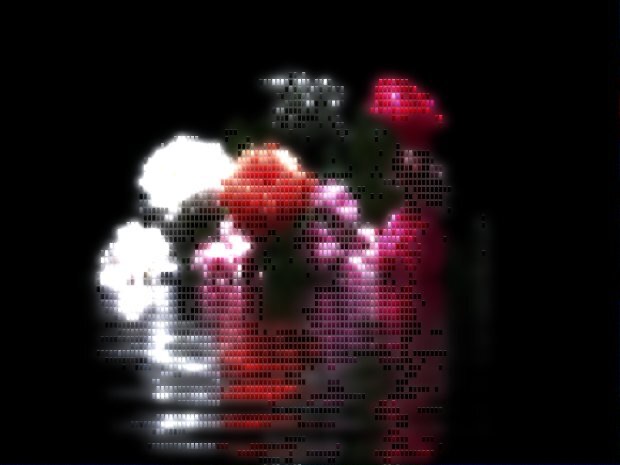
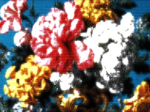
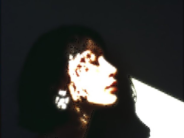
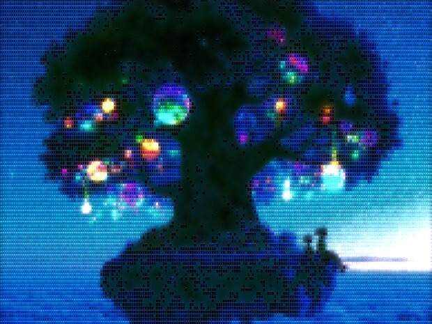
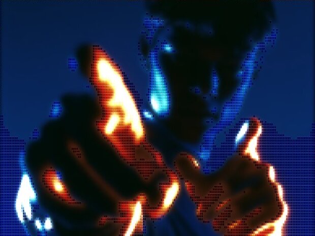
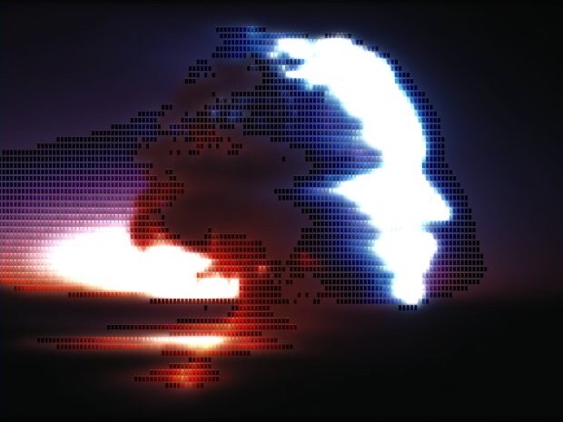
Every image is a real ASCII Magic export, drop your own photo to get the same look, then tune and export up to 4×.
/HOW IT WORKS
Drag any JPG, PNG, WebP, GIF or MP4 into the editor. No upload, your file stays in the browser.
Switch the render mode to Disco, your photo is instantly redrawn in the disco-ball shine look.
Adjust tile size, shine, bloom and flares in real time, from subtle sparkle to full mirror-ball dazzle.
Save as PNG, JPG, animated GIF or MP4, at up to 4× source resolution. No watermark.
/WHY ASCII MAGIC
Reflective faceted tiles wrap your image like a spinning mirror ball.
Built-in bloom and flares add the dazzle of a real disco ball.
Every change previews instantly, tune the shine for parties, posters or music art.
Disco-fy every frame of a clip and export a looping MP4 or GIF; stills export up to 4× source resolution.
/SPARKLE
The Disco mode renders your image as a glittering field of sparkle points, like a frame of light reflected off a rotating mirror ball at Studio 54. Bright pixels in the source become bright sparkles; their position, density, and scale are computed live so the result holds together as an image even as it shimmers. The aesthetic has roots in 1970s nightclub photography, Andy Warhol's Polaroids of Bianca Jagger and Halston, and a strong revival in 2020s editorial fashion shoots and music video B-roll. It pairs beautifully with Color Overlay (try a hot-pink wash) or with the Bloom + Film Grain stack for that '70s film-stock feel.
/UNDER THE HOOD
Disco is a grid pass over your photo, not a sparkle texture pasted on top. The editor lays cells across the frame at the size you set with the Font Size slider: each is that many pixels tall and 60 percent as wide, so tiles come out slightly taller than wide, the proportion you read looking straight at a mirror ball. Every cell averages the pixels underneath it down to one colour and one brightness value, and that pair decides everything that follows.
Brightness then drives the tile four ways at once. Bright cells get a gain of up to about 1.45x, so highlights punch harder than in the source. Each tile is drawn two pixels short of its cell, leaving a dark seam between neighbours, the grout of the ball. The fill is a vertical gradient rather than a flat colour, near-white along the top edge, the tile's own colour just below, roughly 60 percent of it at the bottom. That three-stop ramp is what makes a flat square read as a small curved mirror instead of a pixel.
The fourth is where the shine comes from, and it runs on two thresholds. Past roughly 45 percent brightness a tile gets a hard one-pixel white bar along its top edge, the glint off a real mirrored facet. Past roughly 55 percent it also emits a soft radial burst, drawn additively at a radius wider than the tile itself, so its light spills onto the tiles around it. The bloom and the lens flares are not a filter laid over the finished frame, they are emitted tile by tile, which is why they land exactly on the highlights and why they track the subject when you export a clip.
The practical read: a flat, evenly lit photo shimmers politely and never flares, because almost nothing crosses those thresholds. If your source is soft, push Contrast before you touch anything else.
/CONTROLS
Disco has one slider of its own, Uniformity, and shares the rest of the panel with every other style. Uniformity sets how far each tile may drift from the brightness it measured. At 100 every tile takes its true value and the ball reads clean and even; pull it down and each tile picks up its own repeatable offset, up to about up to a full stop darker and about half a stop brighter at zero, which reads as a hundred separate facets angled at the light. It ships at 80, legible but still enough to break up flat areas.
| Control | What it does on Disco | Where to start |
|---|---|---|
| Uniformity | How far each tile may drift from its measured brightness. Lower is more scattered. | 80, drop to 40 for a busier facet field |
| Font Size | Sets the tile grid, cells are this tall and 60 percent as wide. | Around 11, under 8 for glitter, past 24 for big panels |
| Contrast | Decides how many tiles clear the glint and bloom thresholds. | 100, push to 130 and up on soft photos |
| Brightness | Lifts or drops the frame against those same thresholds. | 0, nudge up to spread the flares |
| Char Opacity | Tile opacity, under its ASCII-era name. Drop it to let the background read through. | 100 |
| Invert Mapping | Flips the tile colours, so dark subjects come back as bright facets. | Off |
| Background | What sits behind the tiles: blurred source, solid black or nothing, plus blur and opacity. | Blur, or solid black for poster art |
| Grayscale & Saturation | Colour of the facets. Grayscale 100 gives a silver, chrome-mirror ball. | 0 and 100, or Grayscale 100 for silver |
| Tint Opacity & Blend | Washes one colour over the render, the hot-pink or cyan club look. | 0, then 20 to 30 percent on Multiply |
| Animation | Pulses each tile on its own phase so the ball twinkles. Speed sets the period, Intensity the depth. | Off for stills, on for GIF and MP4 loops |
Everything previews live, so the fastest route in is to set Font Size until the tiles look right, push Contrast until the highlights flare, then pull Uniformity down until the sparkle reads scattered rather than printed. Full stacks, tint and grain included, live on the recipes page.
/IN PRACTICE
Album art and single covers. A square crop of one face or one figure, tiles around 14 to 20 so the facets are clearly readable at thumbnail size, background set to solid black so the ball floats. Streaming artwork gets shrunk to a few hundred pixels in a phone app, so the usual mistake is tiles too fine to survive it. Export at 4x and check the thumbnail before you commit.
Party posters and event flyers. Leave a genuinely dark area in frame for your type to sit on. Drop Brightness slightly and the flares cluster tighter around the highlights, which keeps clean negative space for a lineup or a door time. Print at 4x, and judge the tile size at full resolution rather than from the preview.
Music video stills and B-roll. Every frame renders on the same settings, so a static camera on a moving subject gives you a ball that stays put while the light travels across it. Turn Animation on and the tiles pulse on their own phases too, which reads as a ball genuinely spinning. Export as MP4 for an edit or GIF for a loop.
Social posts and stories. Vertical crops want larger tiles, since small facets disappear under platform compression. A single subject on a dark ground, tint pushed toward hot pink or cyan, holds up in a feed. For a harder, more broken-up variant of the same night-out energy, the Glitch style and the Dither style cover the neighbouring ground, and video to ASCII covers the same workflow for clips.
/FAQS
/CREATE ART IN SECONDS
Glitter tiles, bloom and lens flares, every change previews instantly, export at up to 4× resolution. Free forever.
Try it out now/RELATED STYLES
Each opens the editor with that style ready. Explore the full styles index.